 Back to News & Insights
DASH, at Your Fingertips: How Interactive Data Tools Reveal Real-World Impact
January 20, 2026 • Reading time 3 minutes
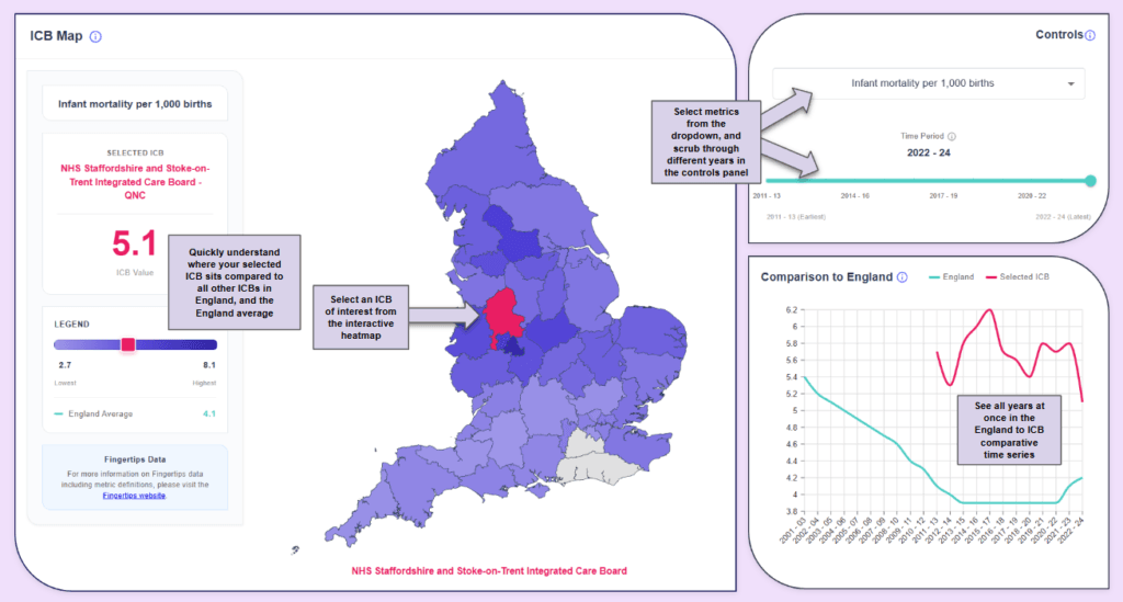
For years, the NHS Staffordshire and Stoke-on-Trent ICB have grappled with infant mortality rates significantly higher than the England average. The ICB knew they had to address this issue and so the Infant Mortality Steering Group was formed in 2023, bringing together representatives from local authorities, the ICB, expert consultants, the Child Death Overview Panel, and community partners.
Their strategy was comprehensive: tackle smoking in pregnancy through a new Stop Smoking in Pregnancy service, implement CO₂ monitoring at every antenatal appointment, ensure 100% referral rates from midwifery colleagues, promote safer sleep environments, and address modifiable factors like maternal BMI. In March 2024, the Staffordshire and Stoke-on-Trent ICB published their progress, documenting the initiatives now underway. But how can one quickly and easily determine the efficacy of efforts like these?
Our new Children & Young People Health Dashboard makes the answer visible at a glance.
Seeing Success in the Data
Leveraging the features in the dashboard, a user can easily pull out a story like this from publicly available data. For example, if you scrub through the years using the controls panel and the heatmap, Staffordshire’s story becomes clear: significantly higher infant mortality rates compared to the England average for years until the most recent data shows a marked decrease, bringing them closer to national levels.
Why This Matters
Strategic health initiatives like Staffordshire’s require significant investment, coordination across multiple services, and sustained commitment from everyone involved. Being able to visualize their impact at-a-glance means more people, from ICB board members to frontline staff to interested citizens, can quickly see what’s working and uncover more impact stories like these.
Why We Built This Tool
We’re very excited to announce this next step in public data curation and access: a React based dashboard built to surface public data. Over the past few years, we’ve built DASH (Data Analytics and Software Hub), our data engineering infrastructure that pulls, cleans and consolidates publicly available health data. What started as an internal tool to save the team hours of repeated data wrangling has evolved into something much bigger.
Initially, we built a PowerBI dashboard to surface NHS performance data (RTT, A&E, cancer waits), which we’ve been summarising monthly. But PowerBI has some frontend limitations meaning that creative freedom was bound by the constraints of the tool. Our recent client work tells the same story: we’ve built React dashboards for clients needing operating room management systems, social care platforms, and healthcare analytics tools because they adapt as requirements change. The tipping point came when a client asked about children’s health data from Fingertips, the UKHSA’s public health database.
With children’s health a key priority in the NHS ten-year plan, we wanted to make Fingertips indicators in this area as accessible and explorable as possible as our first iteration of the dashboard. The DHSC’s Fingertips Tool is invaluable, bringing together public health data across England from infant mortality and school readiness to mental health and healthy aging. But we saw an opportunity to transform static indicators into interactive insights that reveal patterns, trends, and impact stories like Staffordshire’s.
What’s Next
The dashboard proved immediately useful, so we made it public. But here’s where it gets interesting: rather than let it sit static, we’re opening up the roadmap – think of it as the Bandersnatch of public health dashboards – an experiment in community-driven development. Each month, we’ll dedicate development time to building what you tell us would be most valuable. All outputs remain freely accessible.
We’re already exploring expansion to other Fingertips topics like cancer early diagnosis, deprivation indices, and digital literacy metrics. Each offers similar opportunities to track impact, benchmark performance, and tell the stories behind the numbers.
Explore the Children & Young People Health Dashboard and see for yourself how interactive data can reveal real-world health impacts like these.
Want to contribute to the development of the dashboard or discuss how we can help with your organisation? Contact me or the team!
For Those Who Want to See Behind the Curtain…
This dashboard connects via API to curated view tables in DASH (our Data, Analytics and Software Hub), presenting the data through a React application built entirely in TypeScript with Nivo charts for responsive visualization.

Kate Cooper
Kate is a Senior Analyst at Edge Health with a background in International Relations. Recent projects at Edge have involved creating data packs and interactive dashboards analysing variation across a range of pathways such as cancer diagnosis, paediatric elective recovery and orthopaedics across the UK. Kate has led frontend and backend development across platforms including React, Tableau, Power BI, and Looker Studio, creating tools that help healthcare organisations identify gaps and standardise care.